
Maximizing The Value of Combination Charts
In the era of big data, data visualization is a prerequisite for data-driven decision-making. For businesses, governments, or researchers, understanding complex datasets requires user-friendly and expressive graphical representations. When reading this article, you will get insights specifically into the key facets of a combination chart.
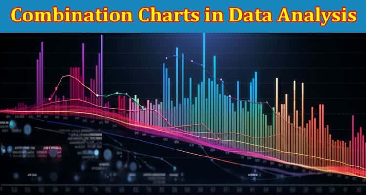
The Basics of Combination Charts in Data Analysis
In a combination chart, a line graph, and a column graph can be merged to display not only the correlation between two sets of data but also their trends and distributions. So, a combination chart can give an in-depth and unified view of the data points.
When working with multidimensional data, combination charts are very potent. They can show multiple measurements, index comparisons, and complex time series analyses. Essentially, combination charts make the interrogation of multidimensional data sets a less daunting task.
Deciding When To Use Combination Charts
The decision to use combination charts is mainly guided by the nature of your data and the relationships you want to explore. They are perfect for showing complex correlations, but forcing simple data into a complex graph defeats the purpose of data visualization. So, it’s crucial to choose wisely.
If your goal is to compare multiple measurements over time or across categories, combination charts are a perfect match. They allow simultaneous visualization of multiple data series, thus facilitating easy comparison
Crucial Tips for Creating Effective Combination Charts
Creating an effective combination chart extends beyond merging different chart types. Several considerations can enhance the clarity and interpretability of your charts. Foremost among these is the principle of simplicity.
While combination charts have the strength to encapsulate complex datasets, their design should be as simple as possible. Extraneous details or superfluous data series can make your chart confusing rather than enlightening. Therefore, always strive to keep your combination charts straightforward and meaningful.
Avoiding Common Pitfalls in Combination Chart Data Analysis
The biggest pitfall in using combination charts is creating a graph that is too complex to follow. While combination charts are designed to handle complex data, they can easily become overwhelming if not structured properly. This defeats the purpose of data visualization, rendering the chart ineffective.
A related pitfall is the misuse of graph combinations. Not all graph types play nicely together, and some combinations can cause more confusion than clarity. Understanding the capabilities and limitations of each graph type in your combination is key to avoiding this pitfall.
Finally, overlooking the role of legends and labels can also get you into trouble. They help to differentiate and understand the various data sets involved in your combination chart. Neglecting them will leave your readers in the dark about what your chart illustrates.
Successful Use of Combination Charts in Data Analysis
The strength of combination charts is best seen in real-life applications. For example, a marketing research company once used a combination chart to study the impact of advertisement expenditure and price changes on product sales. The combination chart excellently revealed the influence of the two independent variables on sales over time.
Overall, these case studies demonstrate that when wisely chosen and well-implemented, combination charts can be a powerful tool in data analysis, enabling users to make robust, data-driven decisions.
Altogether, combination charts are powerful tools for exploring and presenting complex or multidimensional datasets. When to use them, how to create them, and how to avoid their pitfalls are vital knowledge for anyone working with data. As shown in successful real-life applications, wisely used combination charts can illuminate insights, that would otherwise likely remain hidden in your datasets.